Callout
Table of Contents
Anatomy
- Content
Usage Guidelines
Used to add slight prominence to a snippet of content. By default the main visual differentiator is a thin outline, but when a background color is applied via a u-bg--{color} class the outline is removed. The main content slot will accept any HTML elements or other components.
WordPress
The callout Gutenberg block can be used to add this component to posts with flexible inner content. Callouts with fixed content may also be added to article posts in the sidebar via custom meta fields.
Specifications
Properties
| Property | Type | Description | Required | Default |
|---|---|---|---|---|
| el | string | HTML element to be used for the container | No | "aside" |
| slot | string | Inner HTML content | Yes | - |
Styling
Colors
| Name | Application | Custom Property | Roles | Default Opacity | Description |
|---|---|---|---|---|---|
| border-color | border | --tux-comp-callout--border-color | on-background | 0.2 | Outer border color, only applies when no there is no background added |
Custom Properties
| Name | Default | Resets | Description |
|---|---|---|---|
--tux-comp-callout--border-color | var(--tux-theme--shade-color, rgba(0, 0, 0, 0.2) | Yes | - |
Changelog
1.34.0
- callout added
Examples
Default
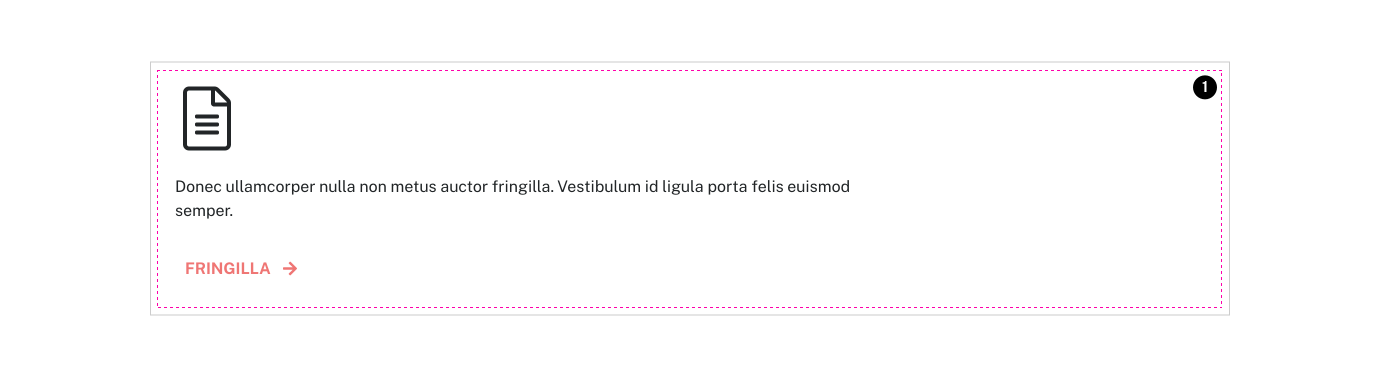
<x-callout>
	{{ fa_icon( 'light/file-alt', 'tux-c-icon--lg' ) }}
	<p>Donec ullamcorper nulla non metus auctor fringilla. Vestibulum id ligula porta felis euismod semper.</p>
	<x-button class="tux-c-button--narrow" href="#example">
		Fringilla {{ fa_icon( 'solid/arrow-right' ) }}
	</x-button>
</x-callout>Long Content
<x-callout>
	{{ fa_icon( 'light/chart-pie', 'tux-c-icon--md' ) }}
	<p class="highlight u-mb200">Elit Fringilla Inceptos</p>
	<h2 class="{{ tux_ff('normalize_heading_sizes') ? 'h3' : 'h4' }}">Dolor Cursus Porta</h2>
	<p>Nullam id dolor id nibh ultricies vehicula ut id elit. Lorem ipsum dolor sit amet, consectetur adipiscing elit. Aenean lacinia bibendum nulla sed consectetur. Vestibulum id ligula porta felis euismod semper.</p>
	<ul>
		<li>Donec id elit non mi porta gravida at eget metus.</li>
		<li>Duis mollis, est non commodo luctus.</li>
		<li>nisi erat porttitor ligula, eget lacinia odio sem nec elit.</li>
	</ul>
	<x-button class="tux-c-button--narrow" href="#example">
		Fringilla {{ fa_icon( 'solid/arrow-right' ) }}
	</x-button>
</x-callout>