Comparison Table
Anatomy
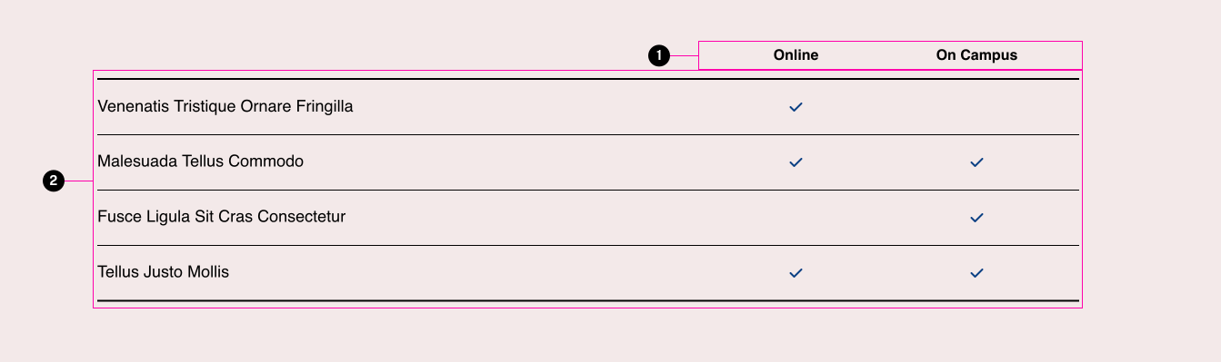
- Columns
- Rows
Comparison Table
Can compare different true/false benefits
Usage Guidelines
The checkmark icons used within this table are standard inline icons and will follow the standard color rules for icons (check for any declared colors in this order: icon color > accent color > text color).
Accessibility
This component is pretty much a regular HTML table, so keep in mind standard table accessibility concerns.
WordPress
If this has a WordPress block or other way of using this in WordPress note that here.
Properties
| Property | Type | Required | Description |
|---|---|---|---|
| columns | array | Yes | Array of strings for column headings |
| rows | array | Yes | array of objects with "label" (string) and "values" (array of boolean values) |
| class | string | No | list of additional classes to apply to main element. |
Specifications
Properties
| Property | Type | Description | Required | Default |
|---|---|---|---|---|
| columns | array | Array of strings for column headings | Yes | - |
| └ item | string | - | - | - |
| rows | array | array of objects with 'label' (string) and 'values' (array of boolean values) | Yes | - |
| └ item | string | - | - | - |
| class | string | list of additional classes to apply to main element. | No | - |
Styling
Custom Properties
| Name | Default | Resets | Description |
|---|---|---|---|
--tux-comp-comparison-table--color | currentColor | Yes | - |
Changelog
5.2.0 (2023-07-24)
1.35.0 (2022-06-30)
- fix: set dynamic sticky height (d731c0f)
1.0.0
- comparison-table added
Examples
Default
| Benefit | Online | On Campus |
|---|---|---|
| Venenatis Tristique Ornare Fringilla | Yes | No |
| Malesuada Tellus Commodo | Yes | Yes |
| Fusce Ligula Sit Cras Consectetur | No | Yes |
| Tellus Justo Mollis | Yes | Yes |
{{ include( 'components/comparison-table.twig', {
	columns: {...}
	rows: {...}
} ) }}