Dialog
Anatomy
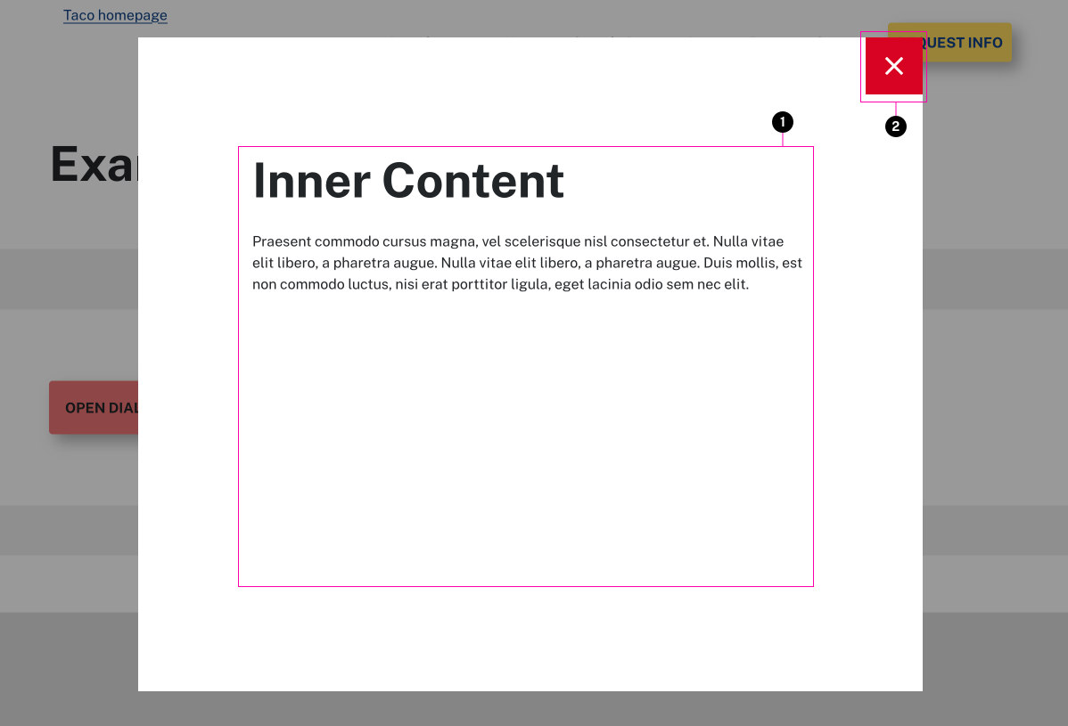
- Content
- Close Button
Usage Guidelines
This is a dialog box that opens up once a button is clicked. It is useful for showing secondary information that is not critical to show in the main content of the page itself. It is primarily used to show faculty data as part of the Faculty Listing pattern, but can show any type of content.
Specifications
Properties
| Property | Type | Description | Required | Default |
|---|---|---|---|---|
| name | string | must be unique to other dialogs on the same page. | Yes | - |
| content | string | Inner HTML markup (raw HTML or other template includes) | Yes | - |
| focus | string | Selector of element to initially focus. Make sure it has a tabindex set. By default it will focus on the close button | No | - |
| post_list | string | ID of an element on the page that has a list of items with data-id attributes | No | - |
| list_type | string | type of list it is | No | - |
| id | string | Used to optionally add functionality to the dialog. | No | - |
Styling
Modifiers
| Name | Class | Description |
|---|---|---|
| Active | .tux-c-dialog--active | As the dialog box is hidden by default, this modifier displays the dialog box. |
| Video | .tux-c-dialog--video | This makes the diloag box have an automatic height based on the video located inside of it. |
Colors
| Name | Application | Custom Property | Roles | Default Opacity | Description |
|---|---|---|---|---|---|
| backdrop-color | background | --tux-comp-dialog--backdrop-color | on-background | 0.5 | - |
| box-bg-color | background | - | background | - | - |
| close-bg-color | background | --tux-comp-dialog--close-bg-color | background | - | - |
| close-text-color | text | --tux-comp-dialog--close-text-color | primary, on-background | - | - |
| close-hover-bg-color | background | --tux-comp-dialog--close-hover-bg-color | primary, on-background | 0.1 | - |
| close-hover-text-color | text | --tux-comp-dialog--close-hover-text-color | primary, on-background | - | - |
| nav-background-color | background | - | primary, on-background | - | used for background color of left and right arrows in the dialog modal window |
| nav-foreground-color | mixed | - | on-primary, background | - | used for the icon color and border of the left and right arrows in the dialog window |
Custom Properties
| Name | Default | Resets | Description |
|---|---|---|---|
--tux-comp-dialog--close-bg-color | #fff | No | - |
--tux-comp-dialog--close-text-color | initial | No | - |
--tux-comp-dialog--close-hover-bg-color | #d90123 | No | - |
--tux-comp-dialog--close-hover-text-color | #fff | No | - |
--tux-comp-dialog--nav-bg-color | #222 | No | - |
--tux-comp-dialog--nav-text-color | #fff | No | - |
Changelog
6.21.0 (2025-01-28)
6.12.2 (2024-06-26)
6.5.0 (2023-12-13)
- fix: skip hidden items when getting next in list (f14b182)
1.28.4 (2022-03-10)
1.18.0 (2021-04-01)
1.7.0 (2020-07-13)
- fix: support custom background color for form (b8970c2)
1.4.2 (2020-06-01)
- fix: properly layer chat popup behind modals (eed5bf7)
1.3.0 (2020-05-08)
1.0.0
- dialog added
Related
Contains
Other core components embedded within this template.
Examples
Default
Inner Content
Praesent commodo cursus magna, vel scelerisque nisl consectetur et. Nulla vitae elit libero, a pharetra augue. Nulla vitae elit libero, a pharetra augue. Duis mollis, est non commodo luctus, nisi erat porttitor ligula, eget lacinia odio sem nec elit.
<x-button data-dialog="example">Open Dialog</x-button>

{{ include( 'components/dialog.twig', {
	name: "example",
	content: "<h2>Inner Content</h2><p>Praesent commodo cursus magna, vel scelerisque nisl consectetur et. Nulla vitae elit libero, a pharetra augue. Nulla vitae elit libero, a pharetra augue. Duis mollis, est non commodo luctus, nisi erat porttitor ligula, eget lacinia odio sem nec elit.</p>"
} ) }}