Floating Action Button
Table of Contents
Anatomy
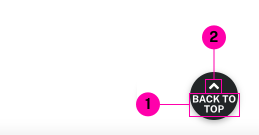
- Main Content Slot
- Icon
Usage Guidelines
Useful for providing a persistent action in the bottom right corner of the viewport. On mobile, it will adjust space to account for the sticky-cta.
This button is set to a fixed size, so be aware that space is very limited. It may be better to select an easy-to-recognize icon and use an invisible aria-label instead for screen readers.
Accessibility
Make sure the screen reader text is an accurate description of what will happen when interacting with this control, using aria-label if there is not enough room to write out a proper label.
WordPress
This component is inserted automatically into single article pages as a "back to top" button.
Specifications
Properties
| Property | Type | Description | Required | Default |
|---|---|---|---|---|
| el | string |
HTML element used as the container. If an href attribute is supplied, this defaults to a instead of button | No | "button" |
| slot | string | Inner HTML content | No | - |
| icon | string | fontawesome icon name | Yes | "solid\/edit" |
Styling
Colors
| Name | Application | Custom Property | Roles | Default Opacity | Description |
|---|---|---|---|---|---|
| bg-color | background | --tux-comp-floating-action-button--bg-color | primary, on-background | - | - |
| text-color | text | --tux-comp-floating-action-button--text-color | on-primary, background | - | - |
Changelog
1.35.0 (2022-06-30)
- fix: auto-adjust space based on sticky-cta (2bd876f)
1.34.0
- floating-action-button added
Related
Contains
Other core components embedded within this template.
Examples
Default
<x-floating-action-button class="u-hide-up--xxl" href="#hello" icon="solid/angle-up">Back to Top</x-floating-action-button>