Tooltip
Table of Contents
Anatomy
- Trigger
- Content
Specifications
Properties
| Property | Type | Description | Required | Default |
|---|---|---|---|---|
| content | string | Simple string of content that appears in the panel on click. Should not contain any HTML. | Yes | - |
| label | string | Accessible label for screen readers | No | "more info" |
| class | string | list of additional classes to apply to main element. | No | - |
Styling
Colors
| Name | Application | Custom Property | Roles | Default Opacity | Description |
|---|---|---|---|---|---|
| bg-color | background | --tux-comp-popover--bg-color | surface | - | - |
| text-color | text | --tux-comp-popover--text-color | on-surface, on-background | - | - |
| shadow-color | shadow | --tux-comp-popover--shadow-color | shadow | 0.25 | - |
Changelog
1.5.0
- popover added
Related
Contains
Other core components embedded within this template.
Examples
Default
{{ include( 'components/popover.twig', {
label: "in-state definition"
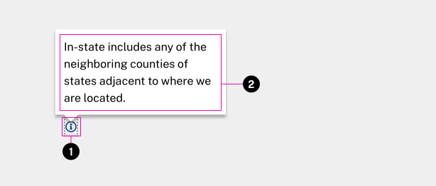
content: "In-state includes any of the neighboring counties of states adjacent to where we are located."
} ) }}