Section Header
Table of Contents
Anatomy
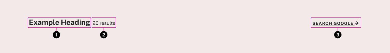
- Heading
- Label (optional)
- Call to Action (optional)
Usage Guidelines
This component can be used to provide a summary at the beginning of a section. It fits use cases such as listing search results or other snippets of content, where you might also want a link to view a full related area of a site. If no label or CTA is needed, it is probably better just to use a plain HTML heading element.
Accessibility
Make sure the heading level is correct so that it properly fits into the page outline.
Specifications
Properties
| Property | Type | Description | Required | Default |
|---|---|---|---|---|
| heading | string | Main heading text | Yes | - |
| h_level | integer | Makes sure the title is the correct heading level for the page outline | No | 2 |
| label | string | Small description next to heading | No | - |
| label_id | string | Can be used to dynamically update label text easily with JS, primarily for counters | No | - |
| link_text | string | Call to action text. If empty link will not show up | No | - |
| url | string | URL for optional call to action | No | - |
| class | string | list of additional classes to apply to main element. | No | - |
Changelog
1.5.0 (2020-06-23)
- fix: correct styling for mobile (a50c8ce)
1.2.0
- section-header added
Related
Contains
Other core components embedded within this template.
Examples
Default
{{ include( 'components/section-header.twig', {
	heading: "Example Heading"
	label: "20 results"
	label_id: "example-section-counter"
	link_text: "Search Google"
	url: "https://google.com/"
} ) }}No Label
Example Heading
Search Google{{ include( 'components/section-header.twig', {
heading: "Example Heading"
link_text: "Search Google"
url: "https://google.com/"
} ) }}No Call to Action
Example Heading
Section 2
{{ include( 'components/section-header.twig', {
	heading: "Example Heading"
	label: "Section 2"
} ) }}