Tabs
Anatomy
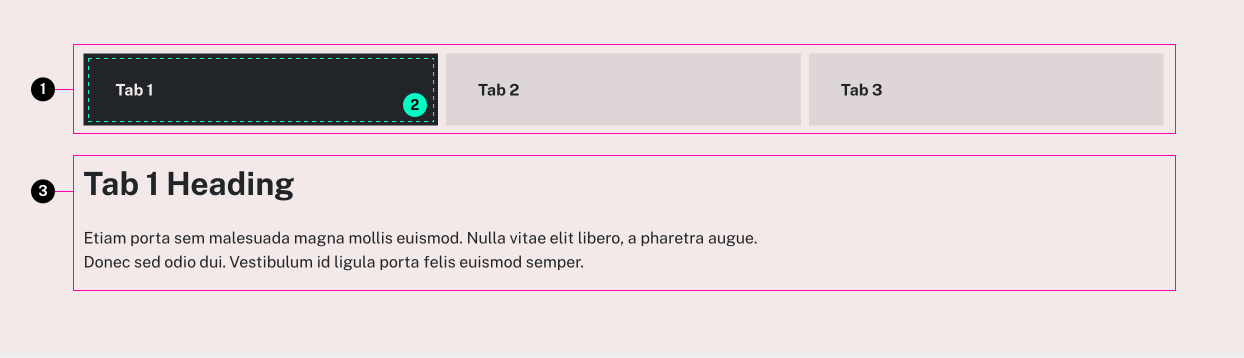
- Tab Triggers
- Active Tab
- Tab Panel
Usage Guidelines
Useful for focusing on one section of information at a time.
If you have more than 3 tabs, consider using a different layout for your content.
WordPress
This component can be added to post content with the Tabs or Program Tabs block in the Gutenberg editor.
Program Tabs
Program Tabs allow you to show programs and specializations in either an unordered list or a summary inside of an accordion. You can narrow down which programs/specializations to show via either the Level of Study or Field of Study.
You can also exclude specific programs/specializations from appearing in this Program Tabs component. To do so, navigate to the program/specialization's edit screen, on the right hand side under either Program Details or Specialization Details you will see an option to "Exclude this from the Program Tabs component?". By default this will be "No". Switch it to "Yes" and then save your changes. The program/specialization will now be excluded from this component.
If you'd like to rearrange the order the Program Tabs appear when filtering by Level of Study this can be done by:
- navigating to Programs > Level of Study in the wordpress sidebar.
- drag and drop your desired order
Training video: https://www.loom.com/share/eca458185038470c9c8bd9f0ba26c092
Specifications
Properties
| Property | Type | Description | Required | Default |
|---|---|---|---|---|
| tabs | array | Pairs of tab title and panel content | Yes | - |
| └ item | object | - | - | - |
| └ title | string | plain text or HTML content that goes in the tab trigger | Yes | - |
| └ content | string | Inner HTML content of the tab panel | Yes | - |
| class | string | list of additional classes to apply to main element. | No | - |
Styling
Modifiers
| Name | Class | Description |
|---|---|---|
| Cards | .tux-c-tabs--cards | Styles the tabs similar to a card component, while keeping the expand/collapse functionality |
| Cards Extended | .tux-c-tabs--cards.extended | Designed to be used with card tabs outside of other containers such as a one-column, this 'extended' modifier can be added to allow them to stretch full width while aligning the tab triggers to the standard site width |
| Wide | .tux-c-tabs--wide | Designed to be used with regular tabs outside of other containers such as a one-column, this modifier allows tab panels to fill their container while keeping the tab triggers within the standard site width |
Colors
| Name | Application | Custom Property | Roles | Default Opacity | Description |
|---|---|---|---|---|---|
| main-color | mixed | --tux-comp-tabs--main-color | on-backgorund | - | - |
| on-main-color | text | --tux-comp-tabs--on-main-color | background | - | - |
| inactive-color | mixed | --tux-comp-tabs--inactive-color | self:main-color, on-background | - | Color for inactive tab text. Also used as the base for deriving inactive background color when inactive-bg-color is not set |
| inactive-bg-color | background | --tux-comp-tabs--inactive-bg-color | self:inactive-color | 0.3 | Background color for inactive tabs. Falls back to inactive-color at 30% opacity |
| inactive-bg-hover-color | background | --tux-comp-tabs--inactive-bg-hover-color | self:inactive-color | 0.1 | Hover background color for inactive tabs. Falls back to inactive-color at 10% opacity |
Changelog
6.30.0 (2025-06-25)
6.25.0 (2025-04-15)
6.20.0 (2025-01-15)
6.19.2 (2024-12-13)
6.19.1 (2024-12-12)
6.19.0 (2024-12-11)
6.12.1 (2024-06-12)
- fix: normalize icon color for card variant in color system v2 (954a6d7)
6.12.1 (2024-06-12)
- fix: normalize icon color for card variant in color system v2 (954a6d7)
6.10.0 (2024-05-01)
6.6.0 (2024-01-24)
6.4.0 (2023-11-27)
- fix: exit keydown handler early if not in a tab (8c46f50)
6.2.0 (2023-10-04)
2.1.0 (2022-10-19)
1.37.0 (2022-08-18)
1.32.0 (2022-04-26)
- fix: exit click handler early if not in a tab (98234c3)
1.28.2 (2022-01-25)
1.28.0 (2022-01-21)
1.23.1 (2021-08-20)
- fix: add correct spacing for sage on mobile (8a7ad3b)
- fix: apply active color to card bg, add text color option (645e0e7)
- fix: reference custom property correctly for tablist (214d8a8)
- fix: support custom colors for artesia (f432a58)
1.22.0 (2021-07-02)
- fix: adjust layout for icons in card style tabs (#121) (01109e3)
- fix: text wrapping bug fix (#126) (cb06544)
1.21.0 (2021-06-14)
1.20.0 (2021-05-26)
1.15.2 (2021-02-03)
- fix: fixed active indicator bug on Internet Explorer (edcc26d)
1.12.0 (2020-10-21)
- feat: add card variation (67018bc)
1.10.0 (2020-09-11)
- feat: support prebuilt panels in 'content' attribute (19467e9)
1.7.0 (2020-07-13)
1.1.0
- tabs added
Related
Contains
Other core components embedded within this template.
Examples
Default
Tab 1
Tab 1 Heading
Etiam porta sem malesuada magna mollis euismod. Nulla vitae elit libero, a pharetra augue. Donec sed odio dui. Vestibulum id ligula porta felis euismod semper.
Tab 2
Tab 2 Heading
Etiam porta sem malesuada magna mollis euismod. Nulla vitae elit libero, a pharetra augue. Donec sed odio dui. Vestibulum id ligula porta felis euismod semper.
Tab 3
Tab 3 Heading
Etiam porta sem malesuada magna mollis euismod. Nulla vitae elit libero, a pharetra augue. Donec sed odio dui. Vestibulum id ligula porta felis euismod semper.
{{ include( 'components/tabs.twig', {
	tabs: {...}
} ) }}Vertical Tabs
Alternative layout for tabs only, does not affect accordion presentation
Tab 1
Tab 1 content. Duis mollis, est non commodo luctus, nisi erat porttitor ligula, eget lacinia odio sem nec elit. Integer posuere erat a ante venenatis dapibus posuere velit aliquet. Praesent commodo cursus magna, vel scelerisque nisl consectetur et.
Fusce dapibus, tellus ac cursus commodo, tortor mauris condimentum nibh, ut fermentum massa justo sit amet risus. Cras mattis consectetur purus sit amet fermentum.
Tab 2
Tab 2 content. Vivamus sagittis lacus vel augue laoreet rutrum faucibus dolor auctor. Donec id elit non mi porta gravida at eget metus.
Fusce dapibus, tellus ac cursus commodo, tortor mauris condimentum nibh, ut fermentum massa justo sit amet risus. Donec ullamcorper nulla non metus auctor fringilla. Maecenas faucibus mollis interdum.
{% set tabs = [
	{
		title: "Tab 1",
		content: "<p>Tab 1 content. Duis mollis, est non commodo luctus, nisi erat porttitor ligula, eget lacinia odio sem nec elit. Integer posuere erat a ante venenatis dapibus posuere velit aliquet. Praesent commodo cursus magna, vel scelerisque nisl consectetur et.</p><p>Fusce dapibus, tellus ac cursus commodo, tortor mauris condimentum nibh, ut fermentum massa justo sit amet risus. Cras mattis consectetur purus sit amet fermentum.</p>"
	},
	{
		title: "Tab 2",
		content: "<p>Tab 2 content. Vivamus sagittis lacus vel augue laoreet rutrum faucibus dolor auctor. Donec id elit non mi porta gravida at eget metus.</p><p>Fusce dapibus, tellus ac cursus commodo, tortor mauris condimentum nibh, ut fermentum massa justo sit amet risus. Donec ullamcorper nulla non metus auctor fringilla. Maecenas faucibus mollis interdum.</p>"
	}
] %}

<x-tabs class="tabs-vertical" :tabs="tabs" />Subtle
Uses the derived hover color (10% opacity) for the active background and panel border colors
Tab 1
Tab 1 content. Duis mollis, est non commodo luctus, nisi erat porttitor ligula, eget lacinia odio sem nec elit. Integer posuere erat a ante venenatis dapibus posuere velit aliquet. Praesent commodo cursus magna, vel scelerisque nisl consectetur et.
Fusce dapibus, tellus ac cursus commodo, tortor mauris condimentum nibh, ut fermentum massa justo sit amet risus. Cras mattis consectetur purus sit amet fermentum.
Tab 2
Tab 2 content. Vivamus sagittis lacus vel augue laoreet rutrum faucibus dolor auctor. Donec id elit non mi porta gravida at eget metus.
Fusce dapibus, tellus ac cursus commodo, tortor mauris condimentum nibh, ut fermentum massa justo sit amet risus. Donec ullamcorper nulla non metus auctor fringilla. Maecenas faucibus mollis interdum.
{% set tabs = [
	{
		title: "Tab 1",
		content: "<p>Tab 1 content. Duis mollis, est non commodo luctus, nisi erat porttitor ligula, eget lacinia odio sem nec elit. Integer posuere erat a ante venenatis dapibus posuere velit aliquet. Praesent commodo cursus magna, vel scelerisque nisl consectetur et.</p><p>Fusce dapibus, tellus ac cursus commodo, tortor mauris condimentum nibh, ut fermentum massa justo sit amet risus. Cras mattis consectetur purus sit amet fermentum.</p>"
	},
	{
		title: "Tab 2",
		content: "<p>Tab 2 content. Vivamus sagittis lacus vel augue laoreet rutrum faucibus dolor auctor. Donec id elit non mi porta gravida at eget metus.</p><p>Fusce dapibus, tellus ac cursus commodo, tortor mauris condimentum nibh, ut fermentum massa justo sit amet risus. Donec ullamcorper nulla non metus auctor fringilla. Maecenas faucibus mollis interdum.</p>"
	}
] %}

<x-tabs :attrs="{variant: 'subtle'}" :tabs="tabs" />Card Tabs (old, v1 only)
Tab 1
Tab 1 Heading
Etiam porta sem malesuada magna mollis euismod. Nulla vitae elit libero, a pharetra augue. Donec sed odio dui. Vestibulum id ligula porta felis euismod semper.
Tab 2
Tab 2 Heading
Etiam porta sem malesuada magna mollis euismod. Nulla vitae elit libero, a pharetra augue. Donec sed odio dui. Vestibulum id ligula porta felis euismod semper.
Tab 3
Tab 3 Heading
Etiam porta sem malesuada magna mollis euismod. Nulla vitae elit libero, a pharetra augue. Donec sed odio dui. Vestibulum id ligula porta felis euismod semper.
{{ include( 'components/tabs.twig', {
	class: "tux-c-tabs--cards"
	tabs: {...}
} ) }}Card Tabs Extended (old, v1 only)
Tab 1
Tab 1 Heading
Etiam porta sem malesuada magna mollis euismod. Nulla vitae elit libero, a pharetra augue. Donec sed odio dui. Vestibulum id ligula porta felis euismod semper.
Tab 2
Tab 2 Heading
Etiam porta sem malesuada magna mollis euismod. Nulla vitae elit libero, a pharetra augue. Donec sed odio dui. Vestibulum id ligula porta felis euismod semper.
Tab 3
Tab 3 Heading
Etiam porta sem malesuada magna mollis euismod. Nulla vitae elit libero, a pharetra augue. Donec sed odio dui. Vestibulum id ligula porta felis euismod semper.
Tab 4
Tab 4 Heading
Etiam porta sem malesuada magna mollis euismod. Nulla vitae elit libero, a pharetra augue. Donec sed odio dui. Vestibulum id ligula porta felis euismod semper.
Tab 5
Tab 5 Heading
Etiam porta sem malesuada magna mollis euismod. Nulla vitae elit libero, a pharetra augue. Donec sed odio dui. Vestibulum id ligula porta felis euismod semper.
Tab 6
Tab 6 Heading
Etiam porta sem malesuada magna mollis euismod. Nulla vitae elit libero, a pharetra augue. Donec sed odio dui. Vestibulum id ligula porta felis euismod semper.
Tab 7
Tab 7 Heading
Etiam porta sem malesuada magna mollis euismod. Nulla vitae elit libero, a pharetra augue. Donec sed odio dui. Vestibulum id ligula porta felis euismod semper.
{{ include( 'components/tabs.twig', {
	class: "tux-c-tabs--cards extended"
	tabs: {...}
} ) }}