Menu
Anatomy
- Items
Usage Guidelines
The menu can be used to display a collection of links to other pages or sections on the current page.
Accessibility
The menu can be navigated by tabbing through each menu item, including subitems.
WordPress
The menu in the site header can be configured under Appearance > Menus.
Specifications
Properties
| Property | Type | Description | Required | Default |
|---|---|---|---|---|
| items | array | - | Yes | - |
| └ item | object | Individual menu item | - | - |
| └ title | string | Label text | Yes | - |
| └ url | string | Link location | Yes | - |
| └ current | boolean | Whether the menu item matches the current page being viewed | No | - |
| └ target | string | target attribute for link | No | - |
| └ children | array | Submenu items | No | - |
| └ item | object | Nested menu items | - | - |
| └ child_menu_class | string | Additional class added to nested menu | No | - |
| rfi_item | boolean | Extra button CTA item added to end of list. Settings are pulled from site options. | No | - |
Styling
Colors
| Name | Application | Custom Property | Roles | Default Opacity | Description |
|---|---|---|---|---|---|
| submenu-bg-color | background | - | surface | - | Applied to submenu dropdowns |
| submenu-bg-color-alt | background | - | background | - | Applied to submenu items that are not in a group when no 'u-bg--' class exists on the submenu |
| submenu-shadow-color | shadow | - | shadow | 0.25 | - |
| submenu-text-color | text | - | on-surface, on-background | - | - |
| item-line-color | border | --tux-comp-menu--item-line-color | primary, on-background | - | used for adding a color to the border underline on hover or current item. Matches the main text by default which as a link is already 'primary' |
| item-hover-bg-color | background | - | primary, on-background | 0.05 | - |
| line-color | border | - | on-surface, on-background | 0.2 | Outer separator for submenus on mobile |
Changelog
6.36.1 (2025-09-26)
6.34.0 (2025-08-28)
6.32.0 (2025-07-28)
6.29.0 (2025-06-11)
6.27.0 (2025-05-14)
6.24.0 (2025-03-25)
6.14.0 (2024-07-31)
6.8.2 (2024-04-02)
- fix: add custom property for item line (44fe122)
- fix: add default modifier for submenu (4c48e37)
- fix: include all menus when generating toggle buttons (#557) (793a749)
4.0.0 (2023-05-24)
3.2.1 (2023-05-02)
- fix: align classes and styling for link items (#412) (b2a04c4)
- fix: remove 'link' class from button menu items (#409) (d423ac5)
2.4.1 (2023-01-24)
1.35.0 (2022-06-30)
- fix: add correct class to dropdown links (7f2042d)
1.29.0 (2022-03-14)
1.27.0 (2021-12-10)
1.18.0 (2021-04-01)
1.1.0
- menu added
Related
Contains
Other core components embedded within this template.
Contained In
Other components that use this component (not including freeform content slots).
Examples
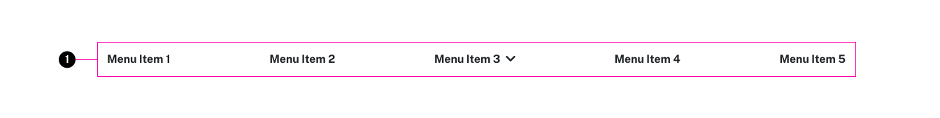
Default
{% set items = [
	{
		title: "Menu Item 1",
		url: "#"
	},
	{
		title: "Menu Item 2",
		url: "#",
		current: true
	},
	{
		title: "Menu Item 3",
		url: "#",
		children: [
			{
				title: "Menu Item 3 - Child 1",
				url: "#"
			},
			{
				title: "Menu Item 3 - Child 2",
				url: "#"
			},
			{
				title: "Menu Item 3 - Child 3",
				url: "#"
			}
		]
	},
	{
		title: "Menu Item 4",
		url: "#"
	},
	{
		title: "Menu Item 5",
		url: "#"
	}
] %}

<x-menu :items="items" />Large Variant
{% set items = [
	{
		title: "Menu Item 1",
		url: "#"
	},
	{
		title: "Menu Item 2",
		url: "#",
		current: true
	},
	{
		title: "Menu Item 3",
		url: "#",
		children: [
			{
				title: "Menu Item 3 - Child 1",
				url: "#"
			},
			{
				title: "Menu Item 3 - Child 2",
				url: "#"
			},
			{
				title: "Menu Item 3 - Child 3",
				url: "#"
			}
		]
	},
	{
		title: "Menu Item 4",
		url: "#"
	},
	{
		title: "Menu Item 5",
		url: "#"
	}
] %}

<x-menu class="tux-c-menu--large" :items="items" />Wide Variant
{% set items = [
	{
		title: "Menu Item 1",
		url: "#"
	},
	{
		title: "Menu Item 2",
		url: "#",
		current: true
	},
	{
		title: "Menu Item 3",
		url: "#",
		children: [
			{
				title: "Menu Item 3 - Child 1",
				url: "#"
			},
			{
				title: "Menu Item 3 - Child 2",
				url: "#"
			},
			{
				title: "Menu Item 3 - Child 3",
				url: "#"
			}
		]
	},
	{
		title: "Menu Item 4",
		url: "#"
	},
	{
		title: "Menu Item 5",
		url: "#"
	}
] %}

<x-menu class="tux-c-menu--wide" :items="items" />Nested Pages
{% set items = [
	{
		title: "Menu Item 1",
		url: "#"
	},
	{
		title: "Menu Item 2",
		url: "#",
		current: true
	},
	{
		title: "Menu Item 3",
		url: "#",
		uid: "test",
		child_summary: {
			heading: true,
			label: "All Menu Item 3 Stuff",
			link: "end",
			link_class: "emphasized-heading"
		},
		children: [
			{
				title: "Menu Item 3 - Child 1",
				url: "#",
			},
			{
				title: "Menu Item 3 - Child 2",
				url: "#",
				child_summary: {
					list_style: "condensed",
					heading: "Some Items"
				},
				children: [
					{
						title: "Menu Item 3-2-1",
						url: "#"
					},
					{
						title: "Menu Item 3-2-2",
						url: "#",
					},
					{
						title: "Menu Item 3-2-3",
						url: "#",
						class: "tux-c-button tux-c-button--outlined"
					}
				]
			},
			{
				title: "Menu Item 3 - Child 3",
				url: "#"
			},
			{
				title: "Menu Item 3 - Callout",
				url: "#",
				class: "tux-c-button tux-c-button--narrow tux-c-button--filled",
				container: "callout",
				container_class: "u-bg--black u-center",
				secondary_text: "Vivamus sagittis lacus vel augue laoreet."
			}
		]
	},
	{
		title: "Menu Item 4",
		url: "#"
	},
	{
		title: "Menu Item 5",
		url: "#"
	}
] %}

<x-menu :items="items" />Nested Pages - Mega
{% set items = [
	{
		title: "Menu Item 1",
		url: "#"
	},
	{
		title: "Menu Item 2",
		url: "#",
		current: true
	},
	{
		title: "Menu Item 3",
		url: "#",
		children: [
			{
				title: "Menu Item 3 - Child 1",
				url: "#"
			},
			{
				title: "Menu Item 3 - Child 2",
				url: "#",
				children: [
					{
						title: "Menu Item 3-2-1",
						url: "#"
					},
					{
						title: "Menu Item 3-2-2",
						url: "#"
					},
					{
						title: "Menu Item 3-2-3",
						url: "#",
						class: "tux-c-button tux-c-button--outlined"
					}
				]
			},
			{
				title: "Menu Item 3 - Child 3",
				url: "#",
				children: [
					{
						title: "Menu Item 3-3-1",
						url: "#"
					},
					{
						title: "Menu Item 3-3-2",
						url: "#"
					},
					{
						title: "Menu Item 3-3-3",
						url: "#"
					}
				]
			},
			{
				title: "Menu Item 3 - Child 4",
				url: "#"
			}
		]
	},
	{
		title: "Menu Item 4",
		url: "#"
	},
	{
		title: "Menu Item 5",
		url: "#"
	}
] %}

<x-menu :items="items" :mega="true" />